Printing
Printing on Pillow Boxes
Almost every color dispute in packaging comes down to one decision made early and without discussion: whether a color was printed as a process build or as a mixed ink. This guide explains the difference and what it costs.
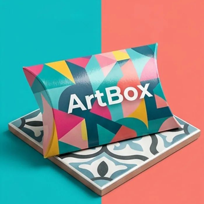
Process printing and spot printing
Process printing — CMYK — builds every color from four inks laid over each other. It is how photographic imagery is reproduced and it is the right choice when a design has many colors.
Spot printing uses a single ink mixed to a formula. It reaches colors process cannot, it lays down flat and even across a large panel, and it reproduces identically between runs and between presses. On a design with one, two or three colors it is often cheaper than a four-color job as well.
The failure mode is using a process build for a color that has to stay consistent. Four inks running at once vary slightly on every press and every run; a single mixed ink does not.
Colors process printing cannot reach
These sit outside the CMYK gamut. A process build of them always comes back duller than the brief:
- Bright and fluorescent pinks
- Vivid oranges
- Saturated violets and purples
- Some intense greens
- Metallics of any kind — those are foils, inks with metal particles, or metallized board
What actually drives the price of a print run
In rough order of impact at typical pillow box quantities.
-
The number of colors
Each one is a plate and a press unit. Going from four colors to two is usually the largest single saving available.
-
Whether the inside is printed
A second pass, and a board coated on both sides. Worth it on gift packaging; unnecessary on most retail.
-
Finishing passes
Lamination, spot UV and foil each add a process. Foil also adds a die.
-
Tooling
The cutting die and any foil or emboss dies. One-off costs, stored for reorders.
-
The board
Real, but usually the smallest of the five at these quantities.
Printing on kraft and on dark board
Ink is transparent. On a white sheet that does not matter, because the paper supplies the brightness. On brown kraft or a dark board every color is effectively a glaze over that ground, and pale colors disappear into it.
The fix is an opaque white printed first, with the artwork on top. It works, and it adds a press unit — so it is worth deciding early rather than discovering at proof. The specifics for brown board are on our kraft stock page.
Matching a brand color
| What you have | What we do | Reliability |
|---|---|---|
| A Pantone reference | Mix the spot ink to formula | High — matches across runs |
| A hex or RGB value | Convert to the nearest Pantone, send a draw-down | Good, once approved |
| A printed sample | Match to it and send a draw-down | Good — a physical reference beats a screen |
| A screen photograph | Interpret, then send a draw-down to approve | Least reliable; expect a conversation |
Questions this raises
Why does my brand color look different between orders?
Almost always because it is a process build. Four inks running at once vary between presses and runs. Specifying it as a Pantone spot ink removes the variable permanently.
Is spot printing more expensive than CMYK?
On a design with one to three colors it is often cheaper, because there are fewer plates and fewer press units. On a design with many colors, CMYK is the economical route.
Can you print white?
As an opaque spot white, yes. Standard CMYK has no white ink — on a white sheet, white is simply unprinted board.
How many colors can I have?
Full CMYK plus up to two spot colors is a common maximum on this format. Beyond that the setup cost rises faster than the visual benefit.
Do I need to see a physical proof?
For any color that matters, yes. A printed draw-down on the actual board is the only reliable approval, and it is far cheaper than a reprint.