Pillow boxes
Pillow Boxes by Color
Color is where packaging orders most often go wrong, and almost always for the same reason: a color that should have been mixed as a single ink was built from four process inks instead. Process builds drift between presses and between runs, and on the large flat panel of a pillow box that drift is visible.
These pages set out how each color family behaves — which shades process printing genuinely cannot reach, which ones need an opaque white beneath them, and where a dyed-through board is worth the premium over printing.
Tell us what goes in the box
Not sure which of these suits your product? Describe it and we will recommend a specification rather than a page.
The full group
Each page covers what that specification does well, where it fails, and what it costs you to choose it.
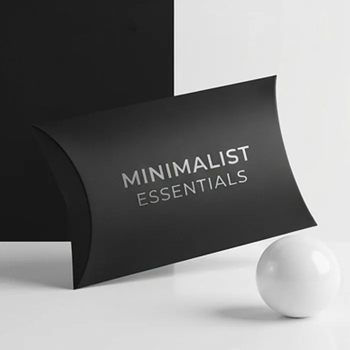
Black Pillow Boxes
Deep matte black with foil or spot gloss — the shortest route to a premium read.
View options
Blue Pillow Boxes
Navy through powder blue, matched to a Pantone rather than mixed from process ink.
View options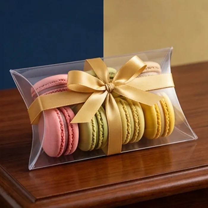
Clear Pillow Boxes
Transparent PET or PVC, for products that sell themselves on sight.
View options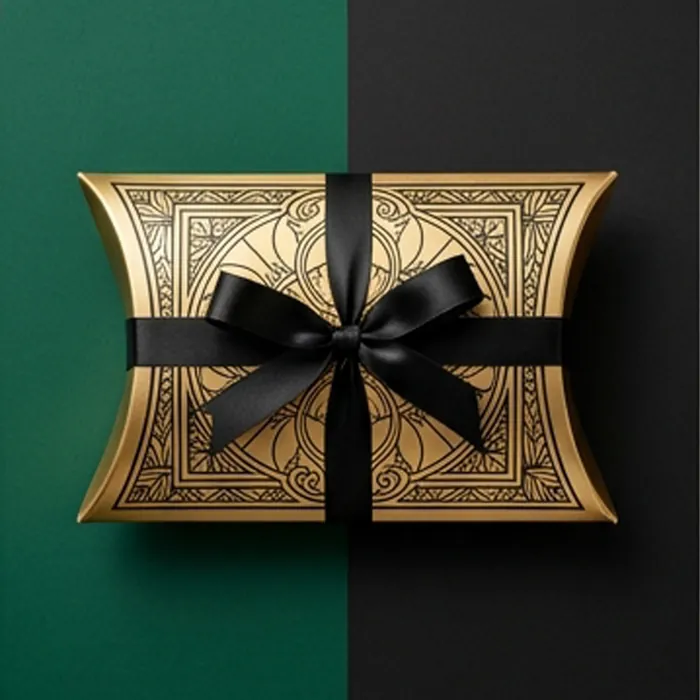
Gold Pillow Boxes
Real metallic foil, metallic board, or printed gold — three different things.
View options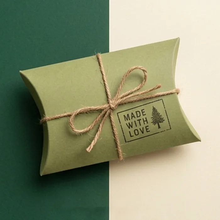
Green Pillow Boxes
Sage through forest — the color most used to signal natural without saying it.
View options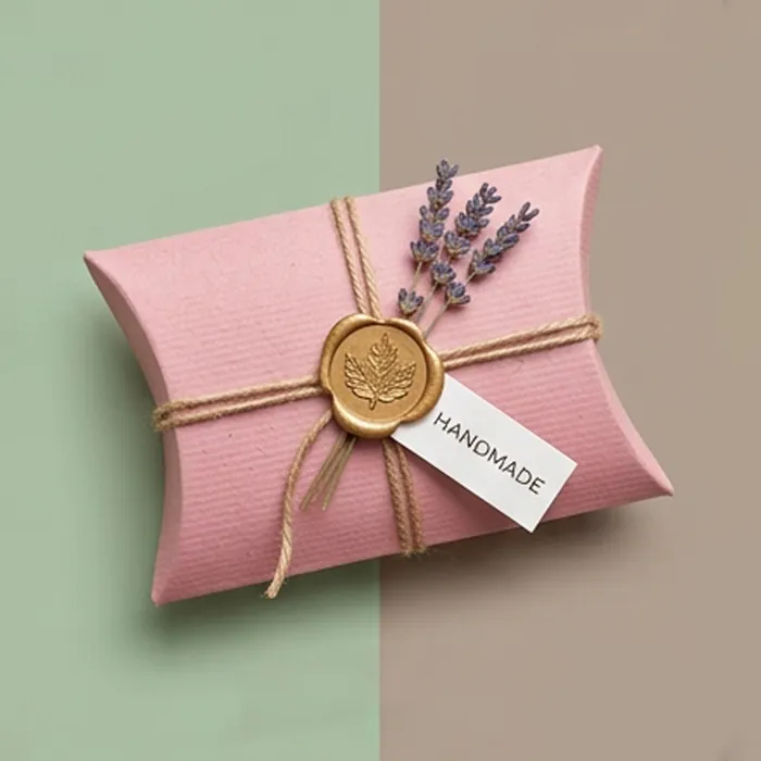
Pink Pillow Boxes
Blush through fuchsia — the shades that need a spot ink to stay consistent.
View options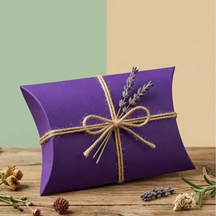
Purple Pillow Boxes
Violet through aubergine — the hardest color to hold in process printing.
View options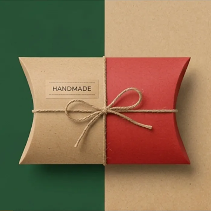
Red Pillow Boxes
Scarlet through burgundy — the strongest shelf color there is, if it holds.
View options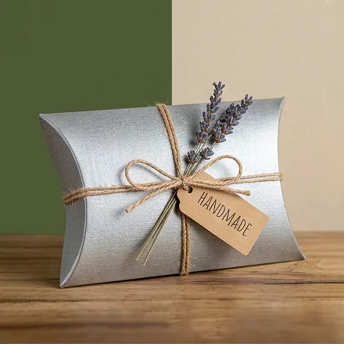
Silver Pillow Boxes
The cool metallic — sharper and more contemporary than gold.
View options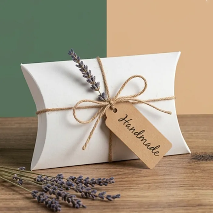
White Pillow Boxes
A clean white face — plain for minimal brands, or the best base for color.
View optionsThe rules that apply across every color
- A brand color that has to stay consistent should be a spot ink, not a process build
- Pale tints show press variation more than dark solids — specify them as solid spot inks
- Any color printed over kraft or a dark board needs an opaque white base
- Where the cut edge and crease will be seen, a dyed-through board beats printed color
- Approve a printed draw-down, not a screen proof — a monitor emits light, ink reflects it
Printed color, or colored board
Printing color onto white board is the standard and the cheapest route. Its weakness is the cut edge: everywhere the box is trimmed or creased, the white substrate shows through, which on a dark box is obvious in the hand.
A dyed-through board carries the pigment in the pulp, so it stays colored at every cut. It costs more, it comes in a limited palette, and on a pack the customer inspects closely it is usually worth it.
By Color: common questions
Can you match my brand color exactly?
With a Pantone reference, yes, printed as a spot ink. From a hex value or a screen color we convert to the nearest match and send a printed draw-down for approval, because screen and ink cannot match exactly.
Why do my boxes look different between orders?
Almost always because the color is a process build. Four inks laid over each other vary run to run; a single mixed ink does not.
Which colors cannot be printed in CMYK?
The brightest pinks, oranges and some greens sit outside the process gamut entirely. They need spot or fluorescent inks — a process build of them always comes out muted.
Is a colored board available in every color?
No. Dyed-through boards come in a limited palette and availability varies, so lead time matters more than for printed color. Ask early if the cut edge color is important to you.
Next step
Send us the product, not a box size
Send the product, the quantity and the date you need it on a shelf. We come back with a written quote, a specification and an honest view of anything in the brief that will not work.