By Color
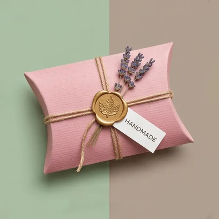
Pink Pillow Boxes
Pink covers an enormous range, from a barely-there blush that reads as neutral through to a fluorescent fuchsia that no process ink can reach. Which end of that range you are on decides how the box has to be produced.
Pale pinks are light screens and drift on press; bright pinks are outside the CMYK gamut and simply cannot be built from cyan, magenta, yellow and black. Both problems have the same solution — mix the color as a spot ink — which is why almost every pink pillow box we quote is specified that way.
- Blush, dusty rose, coral, bubblegum and fluorescent pink
- Spot color mixing for shades outside the CMYK range
- Rose gold and matte white foil, both natural partners to pink
- Uncoated stock for muted, chalky pinks
- Ribbon, twine and printed band options in matched tones
Get a quote for pink pillow boxes
Tell us the product, the size and roughly how many. We reply with a written quote and a specification.
Specification at a glance
| Color routes | Pantone spot ink, fluorescent spot ink, CMYK build |
|---|---|
| Board | Coated white or uncoated, printed to shade |
| Finishing | Matte or gloss lamination, foil, emboss, spot UV |
| Add-ons | Ribbon, twine, printed belly bands, swing tags |
| Minimum order | Quoted per specification |
What happens next
-
We read the brief
And come back with questions rather than assumptions if something is missing.
-
You get a written quote
With the specification stated — board, printing, finishing and any tooling.
-
We draw the dieline
Cut to your product, with the usable print area and crease zones marked.
-
Sample, then produce
A physical sample in the final board before a full run, where it is worth it.
Why bright pink is a spot color, always
Process printing mixes color from four inks. There are colors those four inks cannot reach, and the brightest pinks and oranges sit squarely outside that range. Ask a press to build a fluorescent pink from CMYK and it will produce the nearest it can, which is a dull salmon.
A spot ink is mixed as a single pigment to a formula and printed as one solid. It reaches shades process cannot, holds consistent across runs, and on a box with only one or two colors it is often cheaper than a four-color job anyway.
Three pinks, three different jobs
Blush and nude
- Reads as neutral and expensive
- Suits skincare and fine jewelry
- Best on uncoated or matte laminated stock
- Pairs with rose gold foil and cream ribbon
Dusty rose
- Muted, slightly gray-toned
- The wedding and event standard
- Excellent uncoated with a blind deboss
- Pairs with sage, ivory and antique gold
Hot pink
- High-visibility, youthful, energetic
- Color cosmetics, candy, gifting
- Needs a fluorescent or spot ink to reach
- Pairs with white print and gloss finish
Keeping a pale pink consistent
- Specify it as a solid spot ink, not a percentage tint
- Approve a printed draw-down rather than a screen proof
- Avoid very large unbroken pale panels where mottling shows
- Matte laminate deepens a blush slightly; gloss makes it look thin
- On uncoated stock expect the shade to dry lighter than it prints
What to put on a pink box
Rose gold foil on blush is close to a category convention in beauty, and it works because the two are so close in tone that the foil reads as texture rather than contrast. If you want the mark to actually stand out, a matte white foil or a deep burgundy print does far more.
On hot pink, the strongest partner is plain white — printed, foiled or left as unprinted board. Gold against fuchsia fights; white lets the pink do the work.
- Rose gold foil for a tonal, subtle brand mark
- Matte white foil where the logo needs to read from a distance
- Blind deboss on uncoated dusty rose for wedding work
- Grosgrain or satin ribbon in a matched or contrasting tone
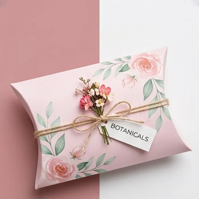
Pink Pillow Boxes: common questions
Answers to what customers most often ask before ordering this specification.
Why does my bright pink print look washed out?
Because it was almost certainly built from process inks. The brightest pinks are outside what CMYK can reproduce. Reprinting it as a spot or fluorescent ink is the only reliable fix.
Will a blush pink look the same on kraft?
No. Over brown kraft a pale pink turns beige, because there is no white beneath it. If you want blush on a kraft-textured stock, we print an opaque white base first, or use a bleached white kraft instead.
Which foil goes with dusty rose?
Antique gold and matte white both work. Bright yellow gold tends to look brassy against a muted rose, and silver reads cold. We can send foil samples against the actual board.
Can I get a pink box with a window?
Yes. Pink with a die-cut window is a common combination for confectionery and bath products where the contents are colorful. Details are on the window pillow box page.
Is fluorescent ink more expensive?
Slightly, and it is also less lightfast — fluorescent pigments fade faster under strong light than standard inks. For a seasonal or promotional pack that is rarely an issue; for a long-life shelf product it is worth knowing.
Can you match a pink from a fabric or product sample?
Send us the physical sample. Matching to a physical object is more reliable than matching to a screen value, and we will select the nearest Pantone and send you a printed draw-down to approve.
Why does my blush pink look different in daylight and in store?
Pale, low-chroma colors shift more under changing light than saturated ones. If the pack sells under warm retail lighting, approve the draw-down under that light rather than at a window.
Can pink be printed on a recycled board?
Yes, though the grayer sheet mutes it. Blush and dusty rose survive that well and often look better for it; a bright or fluorescent pink does not.
What is the most economical way to get a pink pack?
One spot pink on an uncoated white board, with no lamination. It is a single plate and a single pass, and on a natural or wedding-facing product it usually looks better than a four-color job.
Do pink boxes fade faster than other colors?
Fluorescent and some bright pinks are less lightfast than average and will shift under prolonged strong light. For a shelf product with a long life we specify a more stable ink.
Related
Others that suit the same brief
Chosen because they solve a nearby problem — a different material, a different scale, or the same product with one structural change.
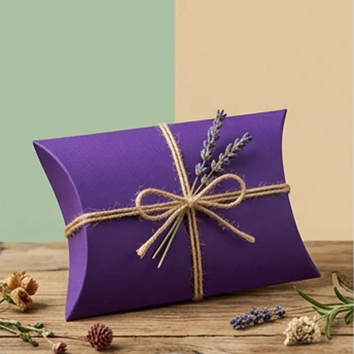
Purple Pillow Boxes
Violet through aubergine — the hardest color to hold in process printing.
View options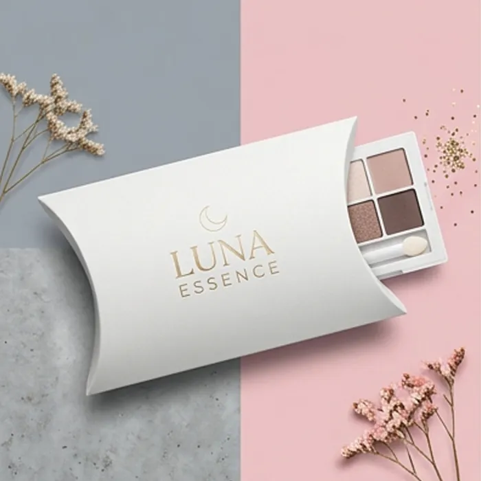
Cosmetic Pillow Boxes
Beauty packaging with room for the regulatory copy nobody plans for.
View options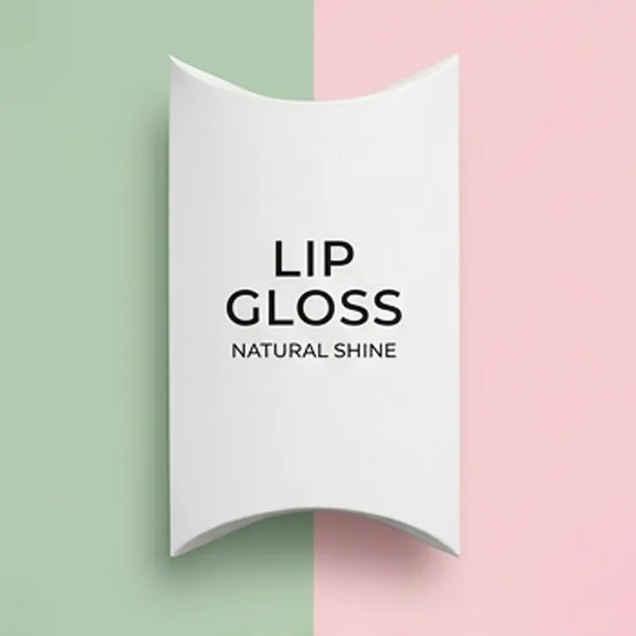
Lip Gloss Pillow Boxes
Wand-tube packaging built for shade ranges and tester handling.
View options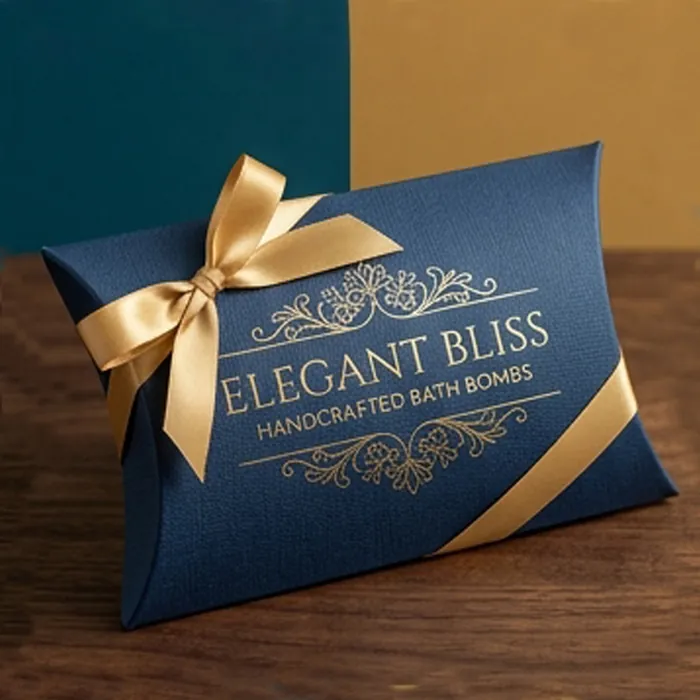
Bath Bomb Pillow Boxes
Moisture-aware packaging for a product that reacts to humidity.
View options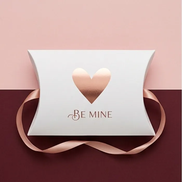
Valentine Pillow Boxes
A short, intense season — blush and red palettes, planned for a two-week sell-through.
View optionsNext step
Ready to specify pink pillow boxes?
Send the product, the quantity and the date you need it on a shelf. We come back with a written quote, a specification and an honest view of anything in the brief that will not work.