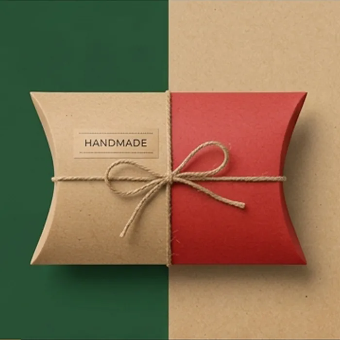
By Color
Red Pillow Boxes
Red draws the eye faster than any other color on a shelf, which is why it dominates confectionery, seasonal gifting and impulse categories. It is also the color where the difference between a warm red and a cool red is most obvious, and getting that wrong changes the entire feel of the pack.
A warm, orange-leaning scarlet reads as energetic and festive. A cool, blue-leaning crimson reads as formal and expensive. Burgundy — red darkened with brown and black — reads as heritage. They are three quite different propositions and they are all "red" on a brief.
- Scarlet, cherry, crimson, wine and burgundy
- Spot color mixing so the shade holds across reorders
- Gold foil, which has the strongest partnership with deep red
- Matte lamination to stop a bright red looking cheap
- Dyed-through red board for a colored cut edge
Get a quote for red pillow boxes
Tell us the product, the size and roughly how many. We reply with a written quote and a specification.
Specification at a glance
| Color routes | Pantone spot ink, CMYK build, dyed-through board |
|---|---|
| Board | Coated white or uncoated, printed to shade |
| Finishing | Matte or gloss lamination, foil, emboss, spot UV |
| Add-ons | Ribbon, twine, printed bands, swing tags |
| Minimum order | Quoted per specification |
What happens next
-
We read the brief
And come back with questions rather than assumptions if something is missing.
-
You get a written quote
With the specification stated — board, printing, finishing and any tooling.
-
We draw the dieline
Cut to your product, with the usable print area and crease zones marked.
-
Sample, then produce
A physical sample in the final board before a full run, where it is worth it.
Warm red, cool red, burgundy
Warm scarlet
- Orange undertone, high energy
- Confectionery, toys, promotional
- Works with gloss and bright white
- Reads as value and volume
Cool crimson
- Blue undertone, more formal
- Cosmetics, gifting, stationery
- Works with matte finish and gold
- Reads as considered and premium
Burgundy
- Dark, brown-shifted, restrained
- Fine confectionery, spirits, heritage brands
- Excellent with antique gold and deboss
- Reads as established and expensive
The technical catch with red
Reds built from process inks are dominated by magenta and yellow, both of which are relatively transparent. A large solid red panel printed in CMYK often looks patchy or thin, particularly across the flat face of a pillow box where there is nothing to distract the eye.
A spot red is a single opaque pigment and covers evenly. It is the difference between a red that looks printed and a red that looks like the box is red — a distinction customers register without being able to name.
Finishing decisions that matter on red
- Matte laminate deepens the color and removes a plastic sheen
- Gloss lifts saturation but pushes a warm red toward looking cheap
- Gold foil against burgundy is one of the most reliable pairings in packaging
- White print on red needs to be opaque or it turns pink
- On a dyed-through red board the crease stays red, which matters on a tuck
Seasonal use, and the trap in it
Red is the backbone of festive packaging, and there is a real commercial reason to keep the shade consistent year to year: customers recognize a returning product by its color before they read the name.
The trap is ordering a seasonal red as a process build. Reorder next year on a different press and the shade moves, which undermines exactly the recognition you were building. A recorded Pantone reference solves it permanently, and it is worth doing on the first order rather than the third.
- Record the Pantone reference on your first order and reuse it
- Order seasonal stock early — festive capacity tightens quickly
- Consider a neutral base box with a seasonal band to reduce waste
- Check the red against your other seasonal materials in the same light
Red Pillow Boxes: common questions
Answers to what customers most often ask before ordering this specification.
Why does my red look patchy across a large panel?
Almost certainly because it is a process build. Magenta and yellow are transparent inks and do not cover a wide flat area evenly. A spot red is opaque and lays down flat.
Which red should I use for Christmas packaging?
A warm, slightly orange-leaning red is the traditional festive shade and pairs with green and gold. A deeper cool red or burgundy is a more contemporary route and works better if your brand is otherwise restrained. Our Christmas pillow box options cover the seasonal range in more detail.
Can white type stay crisp on red?
Yes, as long as it is reversed out properly and the type is not too fine. Very light weights and small sizes can fill in at the edges where the ink spreads, so we may suggest a slightly heavier weight for small print.
Does red fade faster than other colors?
Some red pigments are less lightfast, particularly the brighter warm reds. For a product with long shelf exposure we will specify an ink chosen for stability.
Is a red board available?
Yes, dyed-through red is one of the more commonly stocked colored boards. It gives you a red cut edge and crease, which is noticeable on the curved tuck of a pillow box.
What is the best foil on red?
Gold on burgundy and deep red is the strongest pairing. On a bright scarlet, gold can get lost — matte white or black foil holds its own better.
Can red be printed without a heavy ink smell?
Ink odor comes from the drying process rather than the color, but heavy solid coverage takes longer to cure and can retain a smell. Where the box holds food or fragrance we allow additional curing time before packing.
Does a red box need a different board?
Not for the color, but for the coverage. A large solid red benefits from a board that takes a heavy ink film without cockling, which is a specification we would set rather than something you need to ask for.
Can you match the red on my existing packaging?
Send a physical sample of it. We will match to the printed object and send a draw-down, which is far more reliable than working from a photograph or a screen value.
Is burgundy cheaper than a bright red?
Broadly the same as a spot ink. The saving comes from coverage rather than shade — a design with a burgundy panel and white space costs less than one with an all-over solid, whatever the color.
Related
Others that suit the same brief
Chosen because they solve a nearby problem — a different material, a different scale, or the same product with one structural change.

Christmas Pillow Boxes
Festive packaging on a seasonal schedule — the lead time matters more than the print.
View options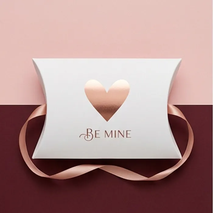
Valentine Pillow Boxes
A short, intense season — blush and red palettes, planned for a two-week sell-through.
View options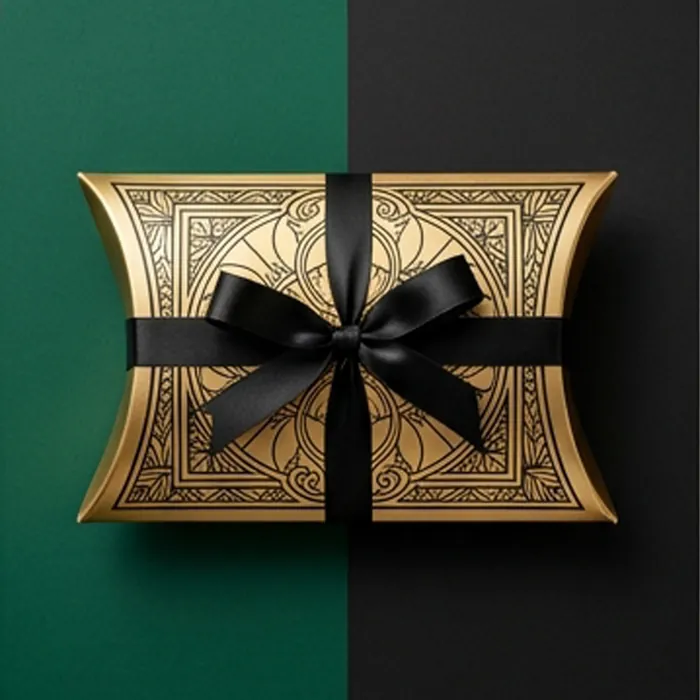
Gold Pillow Boxes
Real metallic foil, metallic board, or printed gold — three different things.
View options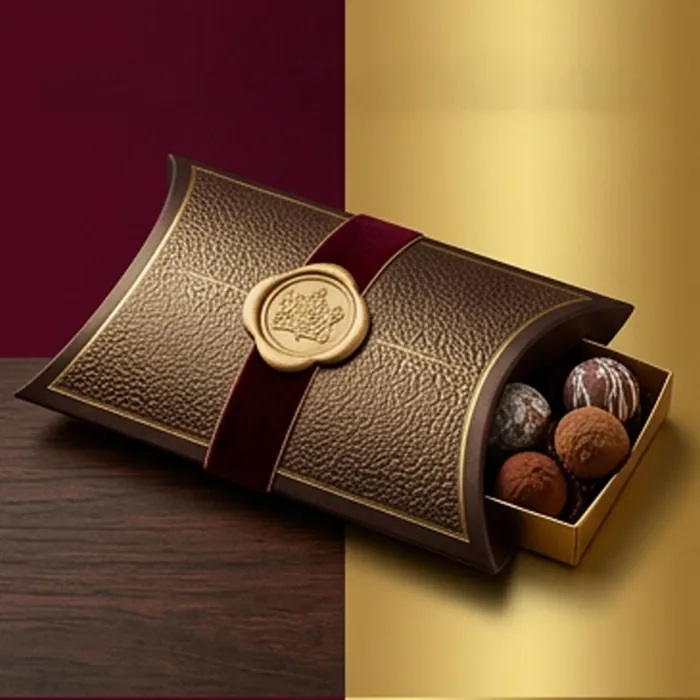
Chocolate Pillow Boxes
Fitted trays and a specification that respects how chocolate behaves in warmth.
View options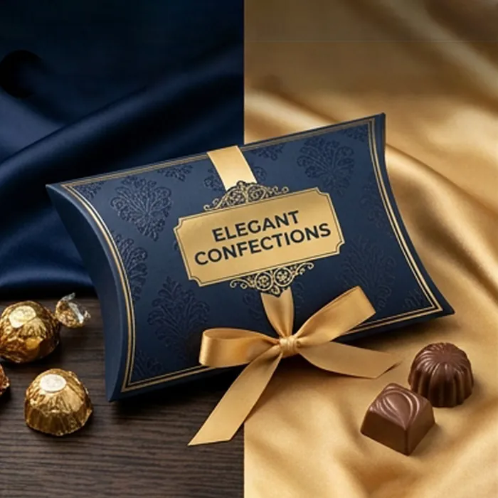
Candy Pillow Boxes
Bright, high-visibility packs for sweets, jellies and mixed confectionery.
View optionsNext step
Ready to specify red pillow boxes?
Send the product, the quantity and the date you need it on a shelf. We come back with a written quote, a specification and an honest view of anything in the brief that will not work.