Materials
Kraft or Cardboard: Choosing Between Them
These two account for the large majority of pillow boxes made, and choosing between them is mostly a question about your artwork rather than your budget. This is the honest comparison.
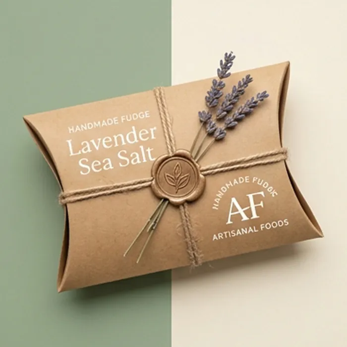
They are not price tiers
The persistent assumption is that kraft is the budget option and coated board the premium one. At the same weight and quantity they are close in price, and the real cost difference comes from what you print: a one-color logo on kraft is cheaper than four-color artwork with lamination on coated board, but that is the printing, not the sheet.
Choose on what the artwork needs and how you want the pack to read, and treat the price difference as a secondary consideration — because it usually is.
Side by side
| Kraft | Coated paperboard | |
|---|---|---|
| Surface | Open, fibrous, absorbs ink | Smooth, holds ink on top |
| Color reproduction | Warmer and duller than the proof | Accurate; Pantone matching reliable |
| Photography | Poor | Excellent |
| Pale and pastel colors | Need an opaque white base | Print directly |
| Inside face | Brown, and looks intentional | White unless printed |
| Foil | Antique golds work; bright golds look brassy | All foils sit cleanly |
| Reads as | Natural, handmade, artisanal | Retail, considered, controllable |
Choose kraft when
- The artwork is a logo, line work or an illustration rather than a photograph
- The palette is dark — black, deep green, navy, burgundy, brown
- The positioning is natural, handmade or environmentally led
- The inside of the box being brown is a feature rather than a problem
- You want the cheapest genuinely branded pack available
Choose coated board when
- The design includes photography, gradients or fine reversed-out type
- A brand color has to match exactly across repeat orders
- The palette is pale, pastel or bright
- You want lamination, spot UV or a soft-touch finish
- The pack has to compete on a shelf against other printed cartons
Where each one actually fails
Kraft fails when a designer sends artwork built for a white ground. Pale tints turn beige, whites disappear entirely without an opaque base, and the whole design comes back looking like a mistake rather than a choice.
Coated board fails when the brief is genuinely natural. Printing brown ink onto a white coated sheet never quite convinces — the surface is wrong, the inside is white, and the pack reads as an imitation of the material it is pretending to be. Full detail on both stocks is on the unbleached kraft board page, and on the coated paperboard page it links to.
Questions this raises
Is kraft cheaper than coated board?
Barely, at the same weight and quantity. The cost difference in a real quote comes from the printing and finishing rather than from the sheet itself.
Can I print white on kraft?
Only as an opaque spot white, which is an extra unit on press. Standard CMYK has no white ink, so anything white in the artwork simply shows the brown board.
Which is stronger?
At the same weight, comparable. Kraft has long fibers and creases well; coated board is slightly stiffer at the same caliper. Neither difference decides a real specification.
Can I have kraft on the outside and white inside?
Yes, with a board that is white-lined on the reverse. It gives you the kraft exterior and a printable white interior, which suits gift packaging particularly well.
Which recycles better?
Both go into paper streams. What actually decides recoverability is the finishing — a laminated kraft box is no easier to recycle than a laminated coated one.