By Color
Blue Pillow Boxes
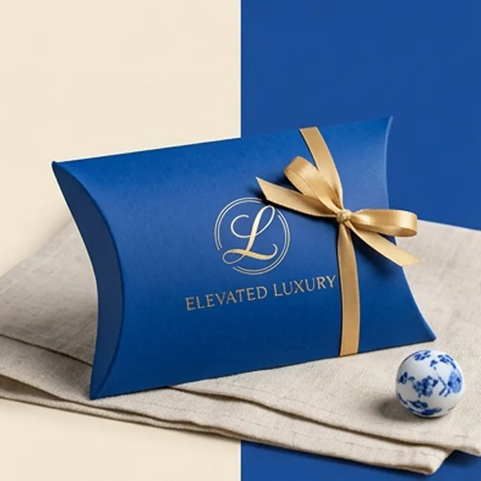
Blue is the most requested non-neutral color in retail packaging, and also the one most likely to come back from press looking wrong. Process blue built from cyan and magenta drifts — a shade too much magenta and a navy goes purple, a shade too little and it goes teal. On a large flat panel, which is exactly what a pillow box is, that drift is visible.
For that reason we quote blue as a spot color wherever the shade matters. A Pantone ink is mixed to a formula, so the box you approve in January reproduces in June. It is a small premium on a job that is otherwise printing one or two colors, and it removes the most common cause of a rejected delivery.
- Spot color mixing to a Pantone reference for shade accuracy
- Navy, royal, cobalt, teal, powder and dusty blue
- Gold and rose gold foil, which both read warm against blue
- Matte lamination to hold the depth of a dark navy
- Contrast interior printing in white, gold or a paler blue
Get a quote for blue pillow boxes
Tell us the product, the size and roughly how many. We reply with a written quote and a specification.
Specification at a glance
| Color routes | Pantone spot ink, CMYK build, dyed-through board |
|---|---|
| Board | Coated white or uncoated, printed to shade |
| Finishing | Matte or gloss lamination, foil, spot UV, emboss |
| Interior | Plain, or printed in a contrast color |
| Minimum order | Quoted per specification |
What happens next
-
We read the brief
And come back with questions rather than assumptions if something is missing.
-
You get a written quote
With the specification stated — board, printing, finishing and any tooling.
-
We draw the dieline
Cut to your product, with the usable print area and crease zones marked.
-
Sample, then produce
A physical sample in the final board before a full run, where it is worth it.
Why navy is the default and where it fails
Navy has become the safe premium color: dark enough to read as considered, warmer than black, and it makes gold foil sing. It photographs well and it hides handling marks better than either black or white.
It fails in one specific situation — under warm retail lighting, a navy with any red in it shifts noticeably purple. If your product sells in an environment lit with tungsten or warm LED, ask for the navy to be approved under that lighting rather than under a daylight-balanced proofing lamp. We can send a printed draw-down for exactly this reason.
Blues we are asked for most
These are reference points, not a fixed range. Any Pantone can be mixed; these simply come up repeatedly.
| Shade | Typical use | Pairs well with |
|---|---|---|
| Deep navy | Jewelry, watches, men's grooming | Gold foil, cream, blind deboss |
| Royal blue | Gifting, corporate and promotional | Silver foil, white print |
| Cobalt | Beauty and color cosmetics | Opaque white, spot gloss |
| Teal | Wellness, candles, bath products | Copper foil, kraft accents |
| Powder blue | Baby, wedding and event favors | White ribbon, rose gold |
| Dusty blue | Weddings and stationery ranges | Uncoated stock, deboss only |
Getting a dark blue to look dark
A flat navy printed thinly looks washed out. These are the levers that give it depth:
- Print as a spot color rather than building it from process inks
- Specify a heavier ink film, or a double hit of the same ink
- Use a matte laminate — gloss lifts a navy toward brightness
- Consider a dyed-through blue board where the cut edge will show
- Keep large solid panels away from the crease at the end curve
Pale blues need the opposite treatment
Powder and dusty blues are used almost entirely in wedding, baby and event work, and there the risk is not depth but consistency. A pale tint is a light screen of ink, and light screens are the most sensitive part of any print run — a small density change on press is invisible in a dark solid and obvious in a pale one.
Running the pale shade as a solid spot ink rather than a percentage screen fixes it. It costs the same and it removes the mottling you sometimes see across a large light panel.
- Specify pale shades as solid spot inks, not tints
- Uncoated board suits dusty and muted blues better than coated
- Blind deboss reads more clearly on pale stock than on dark
- White ribbon and cream twine both work; brown twine fights it
Blue Pillow Boxes: common questions
Answers to what customers most often ask before ordering this specification.
Can you match my exact brand blue?
If you have a Pantone reference, yes — that is what spot inks are for. If you only have a screen value or a hex code, we will convert it and send you a printed draw-down to approve, because a color on a backlit screen never matches ink on board exactly.
Why did my last blue boxes come out purple?
Almost always because the navy was built from CMYK and the magenta ran heavy. Process builds drift between runs and between presses. Moving to a spot ink removes the variable.
Does gold foil work on every blue?
It works best on mid-to-dark blues where the contrast is strong. On a powder blue, gold can look weak — rose gold or a matte white foil usually reads better at that end of the range.
Is a blue board available, or is it always printed?
Dyed-through colored boards exist in a limited palette, and blue is one of the more available ones. It costs more than printing but gives you a colored cut edge and crease, which matters on a pack that is handled.
Will the blue fade?
Under normal retail lighting, no, over a normal sell-through period. Under prolonged direct sunlight — a window display, for instance — some pigments do shift. If that is your situation, tell us and we will specify a more lightfast ink.
Can I have different blues across a product range?
Yes, and it is a common way to code variants. Running several shades in one order is more efficient than several separate orders, so bring the whole range to the quote rather than one line at a time.
Why does the same navy look different on my two products?
Different substrates absorb and reflect ink differently, so a navy on uncoated board and the same ink on a coated sheet will not match. Where a color has to hold across materials, we approve a draw-down on each stock rather than one.
Can a blue box be produced without a purple cast?
Yes, by printing it as a spot ink rather than building it from cyan and magenta. Almost every navy that has drifted purple was a process build where the magenta ran heavy.
Does a pale blue need a different board?
Not a different board, but a brighter one helps. A pale tint over a slightly gray recycled sheet loses the cleanness that makes powder and dusty blues work.
What blue works best behind gold foil?
A mid-to-dark navy. There is enough tonal contrast for the foil to read as metal rather than as a pale mark, and the warmth of gold sits well against a cool ground.
Related
Others that suit the same brief
Chosen because they solve a nearby problem — a different material, a different scale, or the same product with one structural change.
Black Pillow Boxes
Deep matte black with foil or spot gloss — the shortest route to a premium read.
View options
Gold Pillow Boxes
Real metallic foil, metallic board, or printed gold — three different things.
View options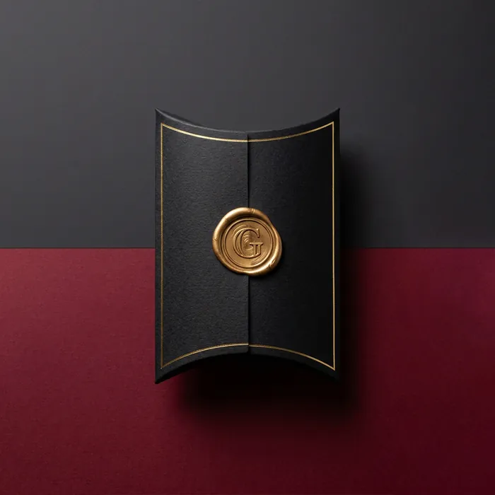
Jewelry Pillow Boxes
Presentation packaging at a fraction of a rigid jewelry box cost.
View options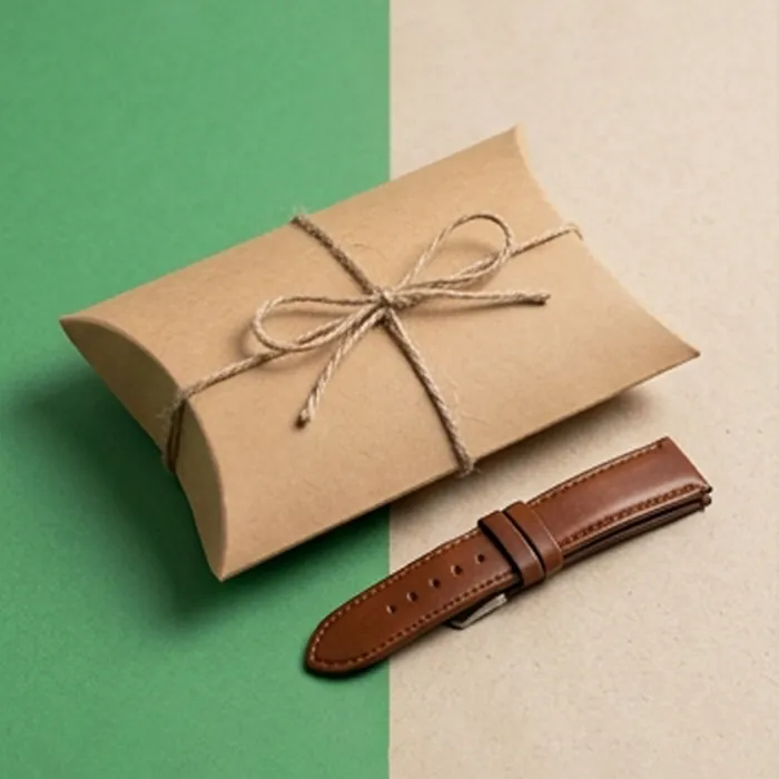
Watch Strap Pillow Boxes
Narrow formats with the lug width and length marked where buyers look for it.
View options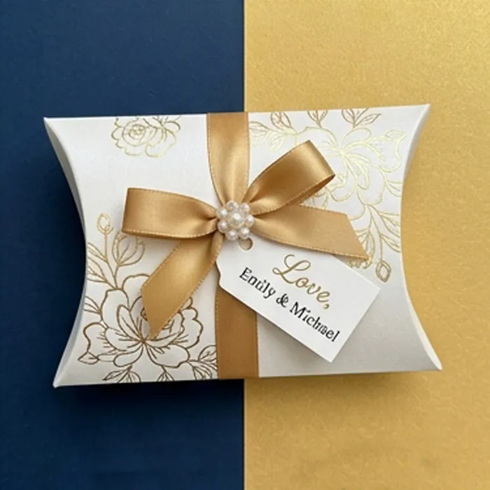
Wedding Favor Pillow Boxes
Small, personal and often named per guest — the most detail-sensitive box we make.
View optionsNext step
Ready to specify blue pillow boxes?
Send the product, the quantity and the date you need it on a shelf. We come back with a written quote, a specification and an honest view of anything in the brief that will not work.